Photoshop Project
Photoshop Project
Location: Millenium Park, Grandville, MI
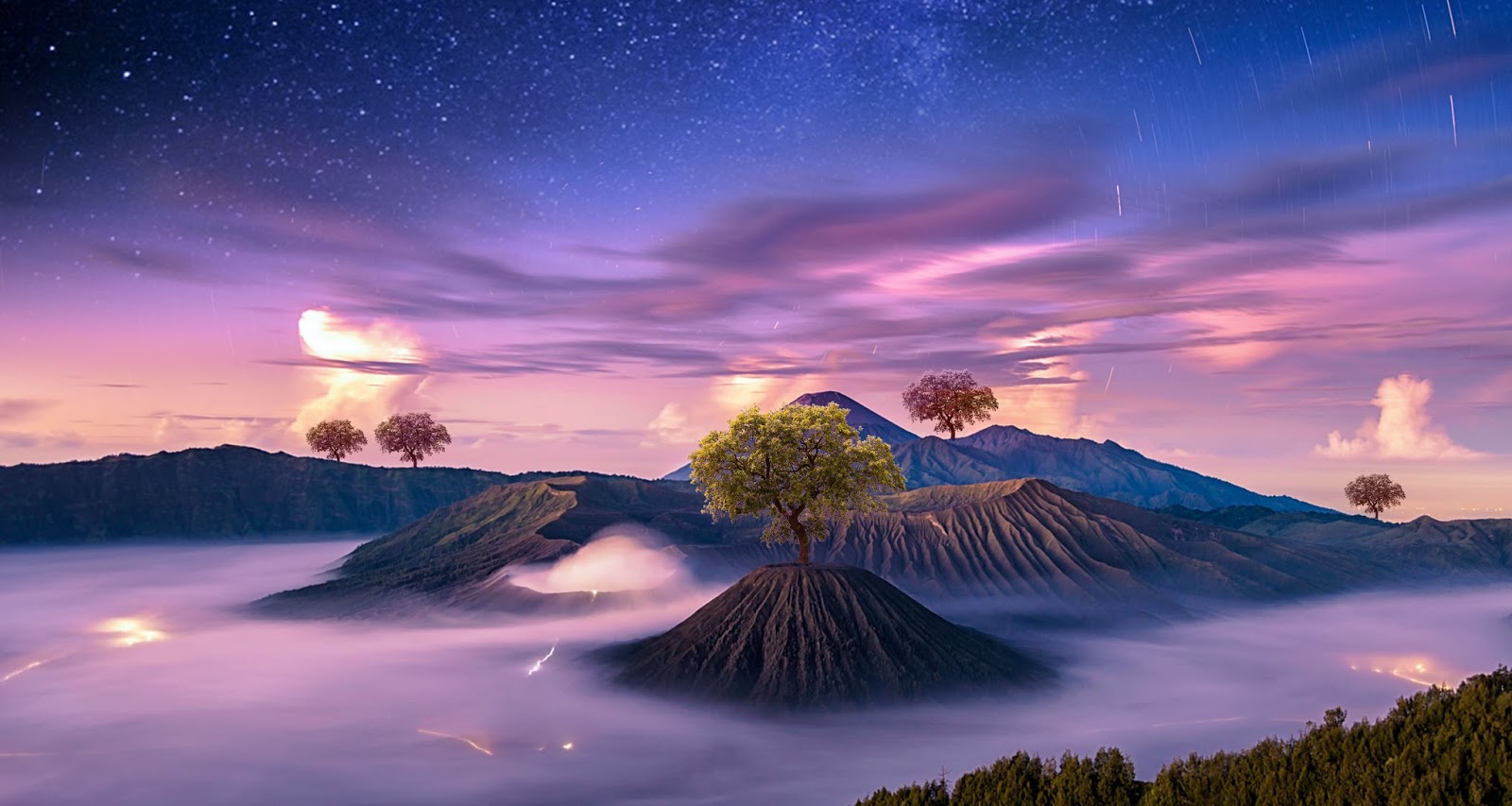
The topic for my postcards is nature appreciation. I believe most of us do not spend enough time enjoying the natural beauty in the world, but instead we get caught up in our everyday lives. We forget to relax. We forget that there’s a whole beautiful world out there because we are busy focusing on stressors like work, school, what we look like, the next cool thing to buy etc. I want to express through my postcards that we all should take time to appreciate nature and breath in the fresh air every once in awhile. I accordingly titled my series of postcards, “Smell the Roses”, based off the common saying “Stop and smell the roses,” meaning drop what you’re doing once in awhile and enjoy what is right in front of you.
Postcard 1: Repetition
This postcard is the repetition of a landscape, to create a very abstract composition. It represents how blinded we can be by our busy lives. The top and bottom dark parts are supposed to resemble eyelids and the middle resembles the natural beauty in the world. When we open our eyes from stress and business, we can see the beauty in the world that we often ignore or take for granted.


Postcard 2: Transformation/Fantasy
This postcard transforms the typical recreational park area. I replaced the pathway, which would normally be made of wood or cement, with water. The water transforms the setting and it creates a feeling of calm and flow. The purpose was to communicate the concept of taking time to relax and take in all of your surroundings, like you’re floating gently down a river instead of power walking through.


Postcard 3: Concealment/Revealing
This postcard uses text as an element. The word I chose to use in my composition was “Chaos”. Our lives get chaotic, and sometimes all we need is to step back and go for a walk in the park or escape into wilderness for a weekend. When we escape into nature, the chaos subsides and we can finally breathe for a bit. I had the word “chaos” appear as though it is in the distance going down and away behind the trees. The chaos is disappearing and then we are just left with peace and stillness.


3-D Rendering

Embossed Text

Fantasy Demo

Pen and Mask Tool Demo


Photoshop Demo


Problem Posing Assignment through (Re)construction of a Place
Chosen place: Millenium Park
Define your chosen place:
Millenium Park is a natural recreational area.
Define your problem:
The problem is people don't spend time in nature enough.
What it is:
Millenium Park is a place.
Why this is a genuine question or problem for you:
I think people should explore nature more and spend more time outside because it is peaceful and good for de-stressing.
Why the question or problem matters to some significant issues related to our understanding of the chosen place:
Because people in our society are often preoccupied by stressors in their lives like work, relationships, to-do lists.
Why the question or problem is important, why should this problem be solved and how could this problem be solved:
It's important to explore the world around you and take in your surroundings, and spend time reflecting upon your thoughts or escaping your thoughts. Spend more time outside to relax and breathe fresh air away from your problems.
Your artmaking strategies: unknown at the moment
Your proposed solutions: unknown at the moment

Very well composed and the photoshop skills are evident here. The first picture was a beautiful take on a horizon, and the river constructed in the second card was very well done
ReplyDeleteYour first postcard is beautiful! I love the colors and it is very obvious that you are great with photoshop. I love how simple they are because they all seem super believable.
ReplyDeleteI think your most creative piece was your Postcard 1 Repetition. I feel that the color usage is very strong and the repetition is very direct. I find myself very intrigued by this image because I keep trying to figure out how to read it. I think that it is really interesting how at the top and the bottom of the image you have these shrub type things hanging and sitting on the bottom and they can both be read well. I read the top one as like a tree hanging slightly over the landscape and I read the bottom set as bushes. I think that those two small things give a lot of depth to the image.
ReplyDeleteI liked the second postcard the most, there is such a wonderful idea behind it, how we need to take our time and enjoy true beauty in nature.
ReplyDeleteThe third post card is my favorite, it looks like part of a sculpture park. I think this is a good solution because it makes the viewer slow down and appreciate the natural things and life, and perhaps step away from the chaos.
ReplyDeleteI liked the vibrancy of the color of the first photograph and the idea behind. I see how it represents opening an eye lid in the morning and focusing on the beauty of nature.
ReplyDeleteThe colors and abstraction in the first postcard is really great. The colors are really dream-esque and repetition adds to that.
ReplyDeleteI think you were very successful in using the photoshop effects with the first postcard. I could see this postcard being blown up to become a giant poster hanging on a wall. It all clicked for me as well when you were describing the effects of the top and bottom of the image being a little darker which in turn highlights the center "beauty" of the park that you were at. Good Job!
ReplyDeleteI really like your second postcard. I think it is really interesting how you used the water. It makes me think of flooding. You don't expect water like that in that area.
ReplyDeleteThe use of color and the manipulation of the environment really work to enhance your concept. The type following the line of the trees fits well with the idea it is expressing as well.
ReplyDeleteI thought the first picture was the strongest of the project. The repetition used alongside the shading/coloration really emphasizes nature and reminds me of a day and night cycle.
ReplyDelete